Add 3D & AR to your Shopify store
Give customers interactive product experiences — rotate, zoom, and view in their own space. No code required.
Three ways to showcase your products
AR Button
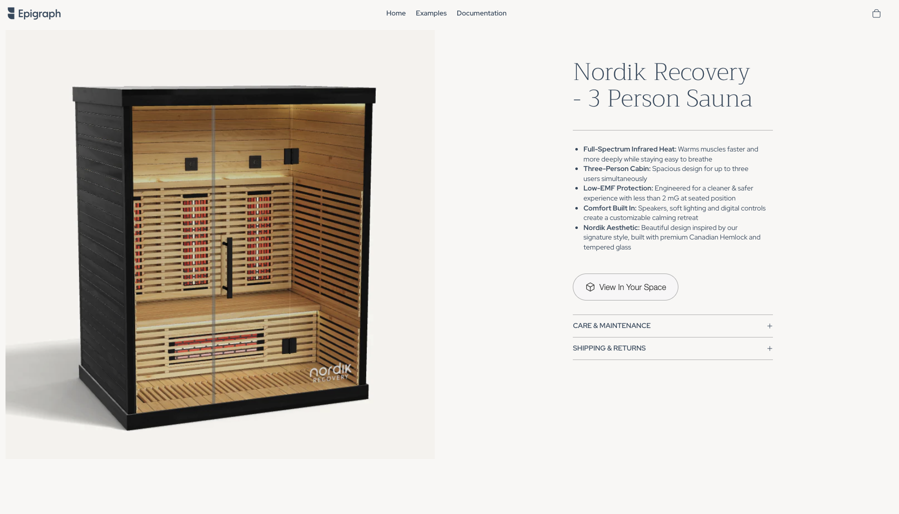
A simple "View In Your Space" button that launches augmented reality on supported devices.
- One-tap AR launch
- Customizable button text & colors
- Automatic device detection
3D Viewer
An interactive 3D product viewer that lets customers explore every angle of your products.
- Rotate & zoom controls
- Toggleable dimensions
- Built-in AR launch
- Optional modal preview for mobile
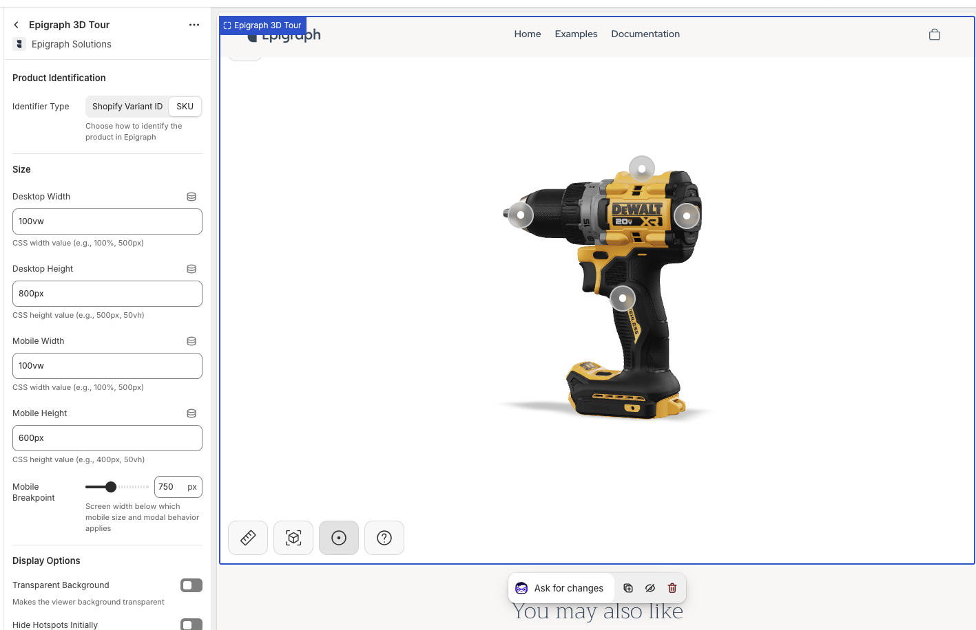
3D Tour
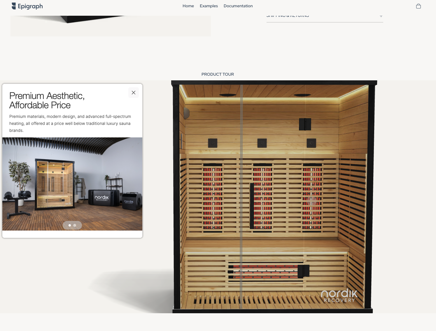
A guided 3D experience with interactive hotspots that highlight key product features.
- Interactive hotspots & callouts
- Guided product exploration
- All 3D Viewer features included
How it works
Install the app
Add Epigraph 3D & AR from the Shopify App Store.
Drag & drop blocks
Open your Theme Editor and add an Epigraph block onto your product template.
Configure & publish
Set your product identifier (Variant ID or SKU), customize styling, and save.
Setup guide
Prerequisites
- An active Epigraph account with 3D content
- A Shopify store with an Online Store 2.0 theme (Dawn, Craft, Crave, etc.)
Template strategy
You can add blocks to your default product template (shows on all products) or create a dedicated template (e.g. product-3d) and assign it only to products with 3D content. The dedicated approach is recommended if not every product has a 3D model.
Identifier type
Each block needs to know which Epigraph product to load. Choose Variant ID (default) or SKU to match how your products are linked in the Epigraph dashboard.
Full documentation
For detailed walkthroughs, block settings reference, and troubleshooting — visit the Epigraph docs.
Adding blocks to your store
There are two ways to add Epigraph blocks to your product pages. Choose the approach that fits your catalog.
Default product template
Best when most or all products have 3D content
Add Epigraph blocks directly to your store's default product template. Every product page will display the 3D viewer — products without 3D content in Epigraph will show an empty state.
- Go to Online Store → Themes → Customize
- Open the page selector at the top and choose Products → Default product
- Click Add block in any section (e.g. "Product information")
- Scroll to the Apps heading and select an Epigraph block
- Configure the block settings (see reference below) and click Save
Dedicated 3D template
Best when only some products have 3D content
Create a separate product template that includes Epigraph blocks, then assign it only to products that have 3D models in Epigraph. Products without 3D content stay on the standard template.
- Go to Online Store → Themes → Customize
- Open the page selector and choose Products → Create template
- Name it something like
product-3dand click Create template - Click Add block, scroll to Apps, and select an Epigraph block
- Configure the block settings and click Save
- In Shopify Admin, open each product with 3D content, scroll to Theme template in the sidebar, and select your new template
Tip: Use Shopify's bulk editor to assign the template to many products at once — select products, click More actions → Edit products, add the Theme template field, and set it in bulk.
Choosing an identifier type
Every Epigraph block has an Identifier Type setting that tells it how to find the matching 3D model. The two options are:
Shopify Variant ID Default
Uses the numeric Variant ID that Shopify assigns to each product variant. Choose this if your Epigraph account was set up using Shopify Variant IDs, or if you're unsure.
SKU
Uses the SKU string you've entered on your Shopify variants. Choose this if your Epigraph account is linked by SKU and your Shopify variants have consistent, unique SKUs.
When a customer selects a different variant (size, color, etc.), the block automatically updates to load the corresponding 3D model.
Block settings reference
Complete documentation for every control in each Epigraph block.
Epigraph AR Button
A standalone button that launches an AR experience on supported devices. Compact and easy to place alongside your add-to-cart button or product details.
| Setting | Type | Default | Description |
|---|---|---|---|
| Product Identification | |||
| Identifier Type | Select | Shopify Variant ID | How the block finds the matching 3D model in Epigraph. Choose Shopify Variant ID or SKU. |
| Button Customization | |||
| Customize Button | Checkbox | Off | Enable to override the default Epigraph button with your own text and styling. When off, the standard Epigraph AR button is used. |
| Button Label | Text | View In Your Space | The text displayed on the button. Only applies when Customize Button is enabled. |
| Button Background | Color | #000000 | Background color of the button. Only applies when Customize Button is enabled. |
| Button Text Color | Color | #FFFFFF | Color of the button label text. Only applies when Customize Button is enabled. |
| Border Radius | Range | 8px | Corner roundness of the button, from 0px (square) to 50px (pill). Only applies when Customize Button is enabled. |
| Advanced | |||
| Enable Debug Mode | Checkbox | Off | Logs diagnostic information to the browser console. Useful for troubleshooting product identification issues. |
Epigraph 3D Viewer
A full interactive 3D product viewer with rotate, zoom, dimension display, and AR launch. Supports an optional modal preview mode for mobile optimization.
| Setting | Type | Default | Description |
|---|---|---|---|
| Product Identification | |||
| Identifier Type | Select | Shopify Variant ID | How the block finds the matching 3D model in Epigraph. Choose Shopify Variant ID or SKU. |
| Size | |||
| Desktop Width | Text | 100% | Width of the viewer on screens above the mobile breakpoint. Accepts any CSS value — 100%, 600px, 50vw, etc. |
| Desktop Height | Text | 500px | Height of the viewer on screens above the mobile breakpoint. Accepts any CSS value — 500px, 60vh, etc. |
| Mobile Width | Text | 100% | Width of the viewer on screens at or below the mobile breakpoint. |
| Mobile Height | Text | 400px | Height of the viewer on screens at or below the mobile breakpoint. |
| Mobile Breakpoint | Range | 750px | Screen width (480–1200px) at which the block switches from desktop to mobile sizing and enables modal behavior if configured. |
| Display Options | |||
| Transparent Background | Checkbox | Off | Removes the viewer's default background, letting your page or section background show through. |
| Modal Preview | |||
| Enable Modal | Checkbox | Off | When enabled, the 3D viewer opens in a fullscreen overlay instead of loading inline. Useful for mobile performance and a more immersive experience. |
| Preview Image | Image | — | A static image displayed before the customer opens the modal. Recommended: a product render at 1200×900px, under 500 KB. |
| Button Text | Text | View in 3D | Label on the button that opens the modal viewer. |
| Button Background | Color | #000000 | Background color of the modal open button. |
| Button Text Color | Color | #FFFFFF | Text color of the modal open button. |
| Button Border Radius | Range | 8px | Corner roundness of the modal open button (0–50px). |
| Mobile Only | Checkbox | On | When enabled, the preview image and modal behavior only apply on screens at or below the mobile breakpoint. Desktop visitors see the viewer inline. |
| Advanced | |||
| Enable Debug Mode | Checkbox | Off | Logs diagnostic information to the browser console. |
| Custom Component Styles | Textarea | — | CSS rules injected into the component's shadow DOM to style internal elements like toolbars, buttons, and dimension labels. Not managed by Epigraph support. |
Epigraph 3D Tour
Everything in the 3D Viewer, plus interactive hotspots that guide customers through product features with callouts, images, and camera animations.
| Setting | Type | Default | Description |
|---|---|---|---|
| Product Identification | |||
| Identifier Type | Select | Shopify Variant ID | How the block finds the matching 3D model in Epigraph. Choose Shopify Variant ID or SKU. |
| Size | |||
| Desktop Width | Text | 100% | Width of the tour on screens above the mobile breakpoint. Accepts any CSS value. |
| Desktop Height | Text | 500px | Height of the tour on screens above the mobile breakpoint. |
| Mobile Width | Text | 100% | Width of the tour on screens at or below the mobile breakpoint. |
| Mobile Height | Text | 400px | Height of the tour on screens at or below the mobile breakpoint. |
| Mobile Breakpoint | Range | 750px | Screen width (480–1200px) at which the block switches from desktop to mobile sizing. |
| Display Options | |||
| Transparent Background | Checkbox | Off | Removes the viewer's default background. |
| Hide Hotspots Initially | Checkbox | Off | When enabled, hotspot markers are hidden until the customer first interacts with the 3D model (rotate, zoom, or tap). Useful for a cleaner initial presentation. |
| Modal Preview | |||
| Enable Modal | Checkbox | Off | Opens the 3D tour in a fullscreen overlay instead of inline. |
| Preview Image | Image | — | Static image displayed before the customer opens the modal. |
| Button Text | Text | View in 3D | Label on the button that opens the modal. |
| Button Background | Color | #000000 | Background color of the modal open button. |
| Button Text Color | Color | #FFFFFF | Text color of the modal open button. |
| Button Border Radius | Range | 8px | Corner roundness of the modal open button (0–50px). |
| Mobile Only | Checkbox | On | Modal preview only applies on mobile-width screens. Desktop visitors see the tour inline. |
| Advanced | |||
| Enable Debug Mode | Checkbox | Off | Logs diagnostic information to the browser console. |
| Custom Component Styles | Textarea | — | CSS rules injected into the component's shadow DOM to style internal elements like hotspots, toolbars, and callout panels. Not managed by Epigraph support. |
Frequently asked questions
Which Shopify plans are supported?
Epigraph 3D & AR works with any Shopify plan that supports Online Store 2.0 themes — Basic, Shopify, Advanced, and Plus.
Does it work with my theme?
The app works with any Online Store 2.0 theme, including Dawn, Craft, Crave, Sense, and most premium themes from the Theme Store. Vintage/1.0 themes are not supported.
Do I need an Epigraph account?
Yes. This app displays 3D content hosted in your Epigraph account. You'll need an active Epigraph subscription with 3D models uploaded and linked to your Shopify products via Variant ID or SKU.
What's the difference between the blocks?
The AR Button is a simple button that launches augmented reality. The 3D Viewer provides an interactive 3D model with rotate, zoom, dimensions, and AR. The 3D Tour adds interactive hotspots and guided exploration on top of everything the Viewer offers.
How does variant switching work?
When a customer selects a different variant (size, color, etc.), the viewer automatically updates to show the corresponding 3D model — if you have different models configured in Epigraph for each variant. If you use one model for all variants, it simply stays the same.
Is the app free?
The Shopify app itself is free. You pay for your Epigraph subscription separately, which covers 3D model hosting, AR capabilities, and usage.